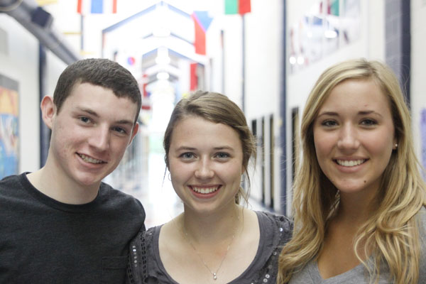
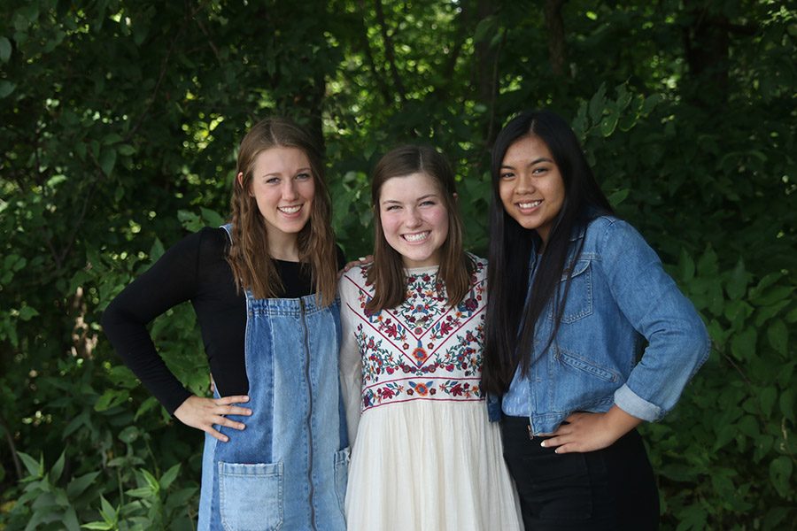
Austin speaking:
Last year, many of JagWire‘s covers were illustrations done by our beast of an artist, 2012 graduate Adam Henderson. While he always did an awesome job and is beyond talented, us three editors decided we preferred having photo illustrations on our covers. A photo illustration is essentially a posed or manipulated photo and its goal is to tell a story in that one frame. People often tell you not to judge a book by its cover, but whoever said not to judge a newspaper by its cover? Obviously a captivating cover is what gets people to read our paper, so it’s crucial that we come up with something awesome. The cover photo illustrations always correlate with our double page spread and have all been taken by Kristina this year, who has done a great job. One exception was our issue three cover, which was a dream catcher painting done by our artist, Riley McDonald. The photo illustrations we’ve done this year are a bit hard to describe in a short amount of words, but if you check out our Issuu profile you can look at digital versions of each of our papers.
Kristina speaking:
Similar to what Austin said, we’ve started doing photo illustrations for our covers instead of the usual cartoons we did last year. In my opinion, photo illustrations have a more modern feel and convey a stronger, more realistic message. The illustrations are also really fun to pose. We usually take about a full class period to model and pose our illustrations, often trying out a few different techniques such as adjusting the light. We debate the different photos and pick the best photo illustration that accurately represents our double page topic.
Hanna speaking:
Well, Hanna should be speaking, but she’s been home sick. Hanna, if you’re reading this, you best be rested and feeling better by Monday’s long worknight.


